MarketMate
MarketMate was designed and prototyped as a user-centric mobile application to connect users with local markets, enhancing the local shopping experience and supporting small businesses. This is a theoretical project that I completed as an end-to-end process.Problem:
The problem is not knowing about all the markets in your area. It is also time consuming to look up each market to see when it is occurring and through what seasons.Solution:
A solution is an app that uses location to show markets in your area. Provides dates of operation, hours, location, and types of vendors in attendance. Social media aspect vendors can tag which market they are at and if you follow them you know which market to go to find what you are looking for.-
Tools
-Figma
-Sketch
-Adobe
-
Role
-UX/UI Designer
-End-to-End Project
-
Timeline
-Overall: 2 months
-Discovery & Research: 2 weeks
-Design & Testing: 6 weeks
-
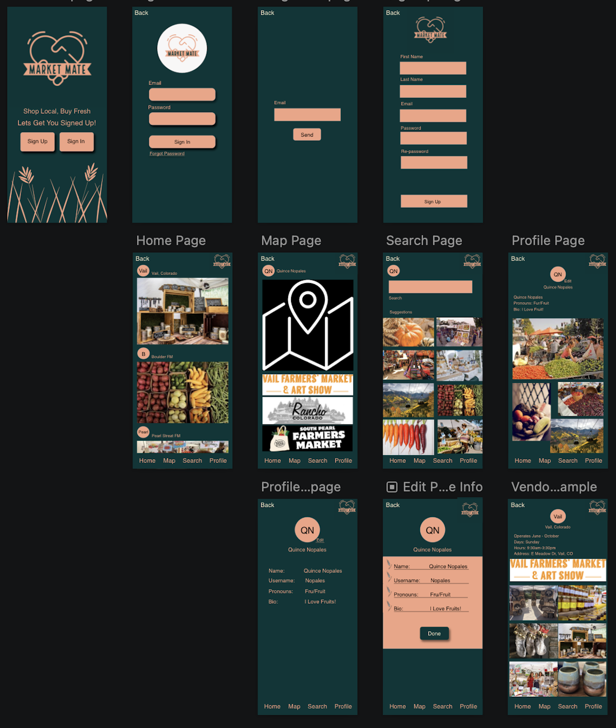
![]()
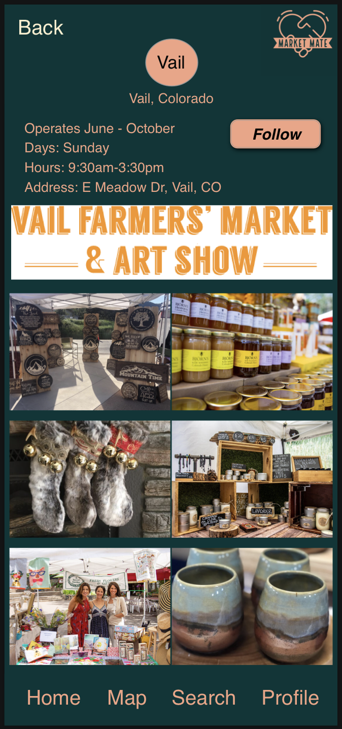
Home Page
-
![]()
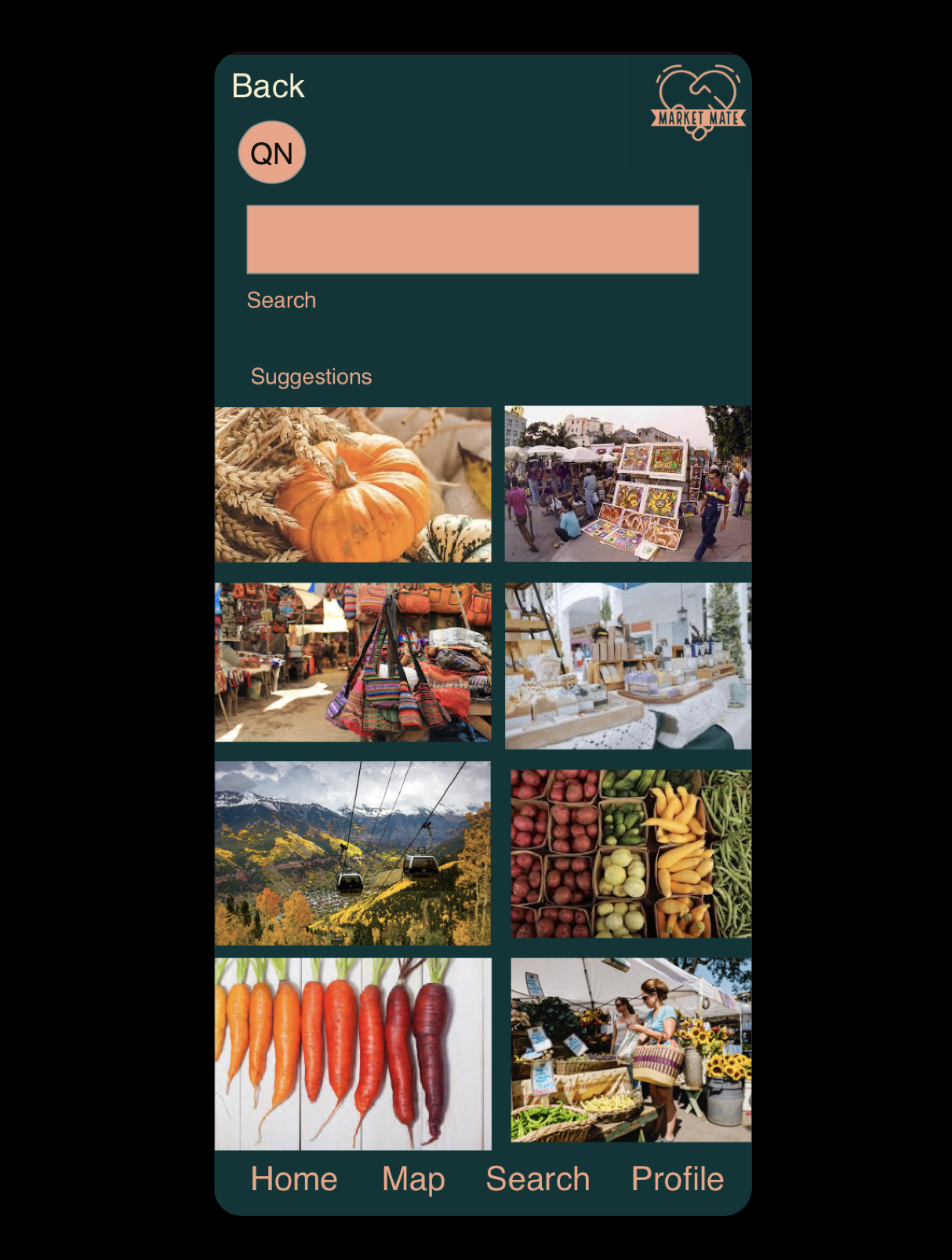
Search Page
-
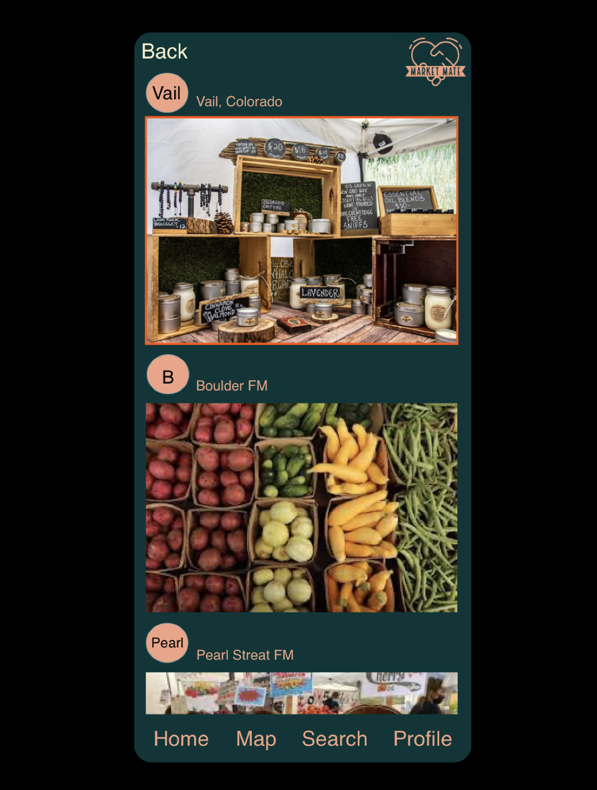
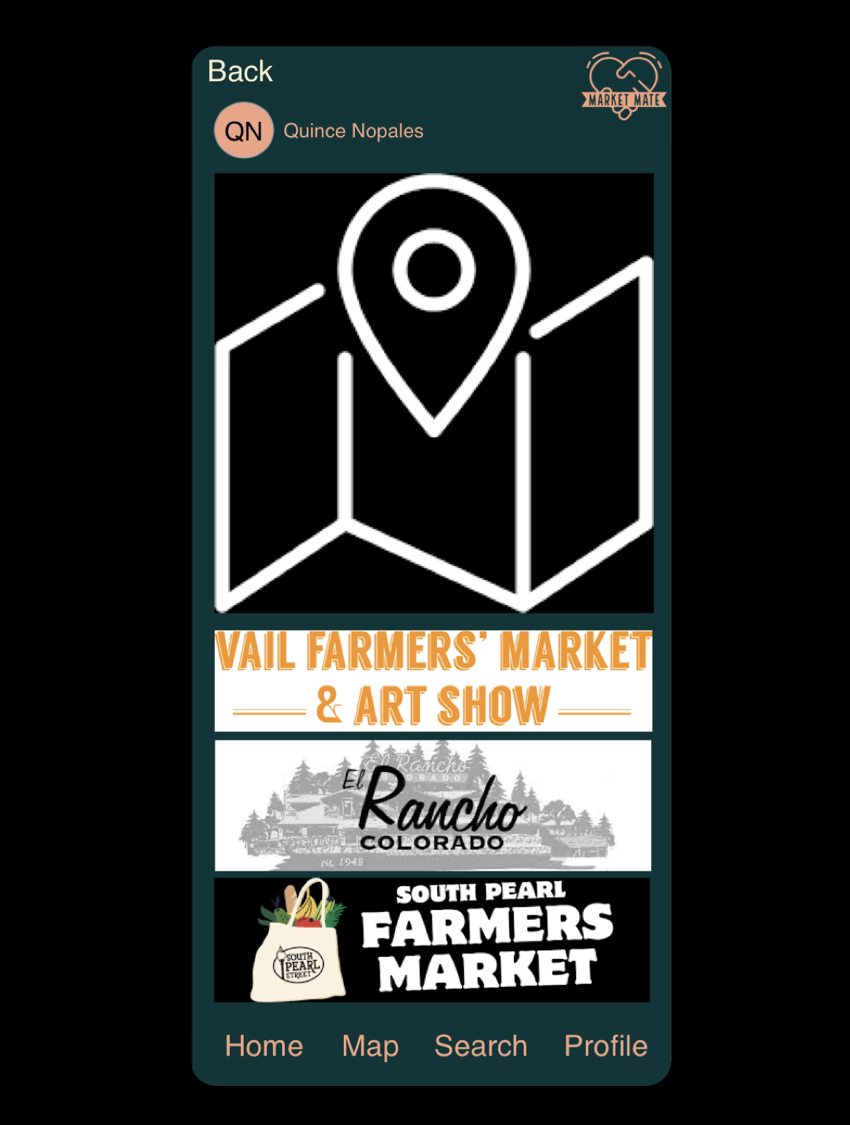
![]()
Map Page
-
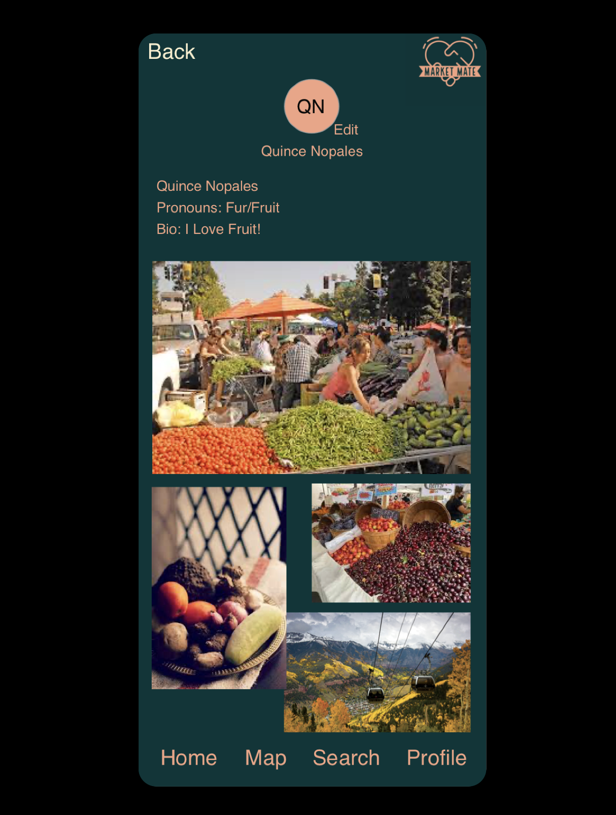
![]()
Profile Page
-
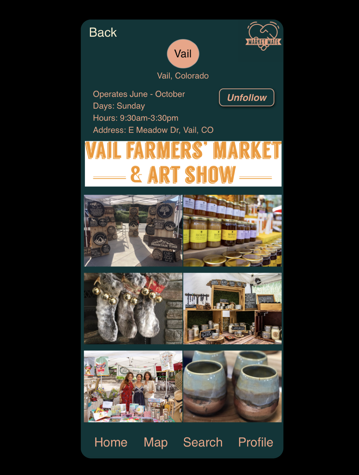
![]()
Vendor Page
-
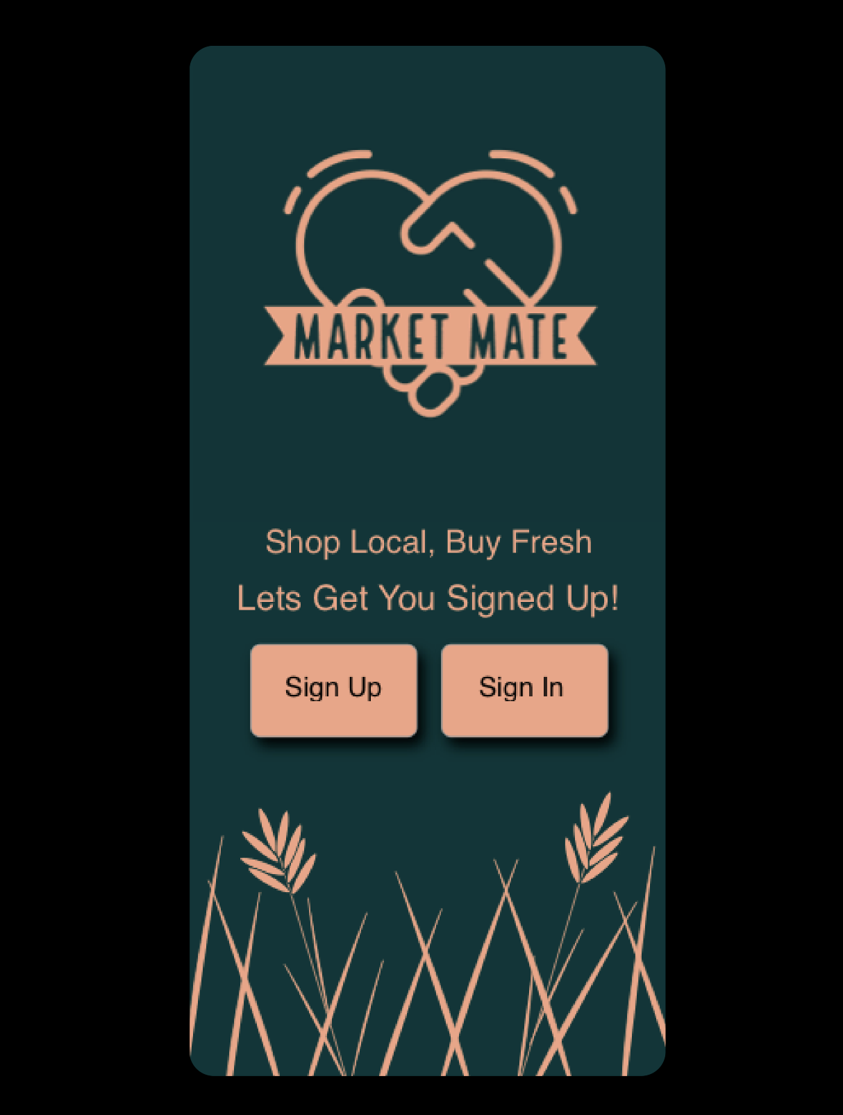
![]()
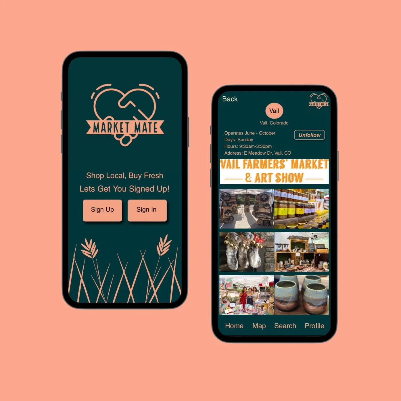
Welcome Page
My Design Process
Concept & Research Marketing
The concept is to create a go to application where you can find all the information you need on famers/artisan markets no matter where you are. Looking into other apps on the market their is nothing that fills that niche. Some local apps but nothing that reaches beyond a local geographical area.Sketches
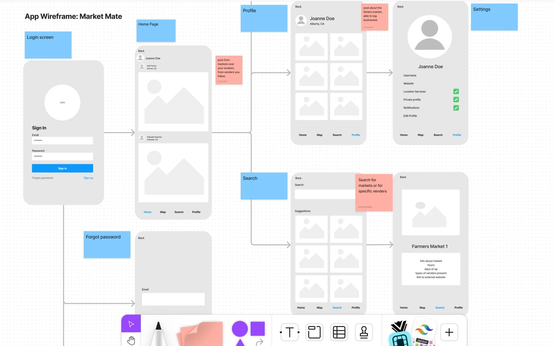
I began the design process with low-fidelity sketches and wireframes to accelerate decision-making through visualization without losing time. My sketches were based on the initial conceptualization and purpose of the application. The sketches gave initial feedback on user flow and showed any immediate pain points that would be to be resolved. Each point was then able to be addressed when building a wireframe, continuously referring back to the initial sketches.The original sketches were for brainstorming and to get a feel for what the user journey would potentially look like.The sketches were based off of how other applications are designed. Using similar layouts and features makes it easy and intuitive for users.Only one sketch was created but the wireframe was changed from the original sketches more than once as areas for improvement where pinpointed.Layout and arrangementLanding page (home page) shows all of the famers markets the user is following. Showing there feeds and updates in a scroll fashion with the most recent at the top.The bottom of the page has a menu where you can always access the home, map, search, and profile pages.In the map you will be able to select a desired location and find all the famers markets in that area. Once selected you can then click on individual markets or scroll down to see the list view of the markets.I chose to do both a map and list so that it is more accessible to visual and spatial learners and those with visual impairments will be able to zoom in to make it easier to see the locations.
WireFrames
WireFrames

Using Figma, I translated my first sketches into low-fidelity wireframes. I also turned that wireframe into a a user journey map. This gave me the best idea on what the product would look like and how it would flow from the users side. I used whiteboard in Figma to create the wireframe and adjust user journey throughout several iterations.
User Journey
With MarketMates goal in mind, I made sure that the users have an enjoyable experience utilizing the app to explore farmers and artisan markets in their area. I sketched a current-state user journey map, to identify opportunities for improvement. Identifying 2 unnecessary steps and potential drop-off points in the flow. By eliminating these from the new design, it ended up being a much smoother experience.Eliminated the users ability to post anythingThe Map function went from being just a map to being both a map with the list of local farmers markets below.
Usability Testing
I created a fully-functional, high-fidelity prototype of the new flows using Sketch. After completing the prototype I did a round of usability testing to see what issues users would have with the app. After that data was analyzed the prototype was iterated upon to tested again.lIssue 1The first issue that came up was that a way to see what markets you are following was not available in the app nor had a follow button been added to the farmers market profile page in the prototypeSolution 1This issue was remedied by adding a follow button to the Vail Farmers Market profile page and a way to see who you are following on the individuals profile. After these additions were made a second usability test was done. This solution solved issue 1 for the users in the test.
UI Design
Once the usability issues were resolved, I moved on to design the final screens in Figma. My goal was to create a visual identity that is unique to this app. I wanted it to have a minimal feel to it while having the colors remind you of nature. I chose a dark style so that the photos would contrast well, it also gives the app a warmer feel when interacting with it. This was only designed as a mobile application at this time.