Evo Feature Redesign Mobile
The Problem
Members of Evo are having trouble understanding how to access and utilize their membership points. This is a problem for users across platforms.
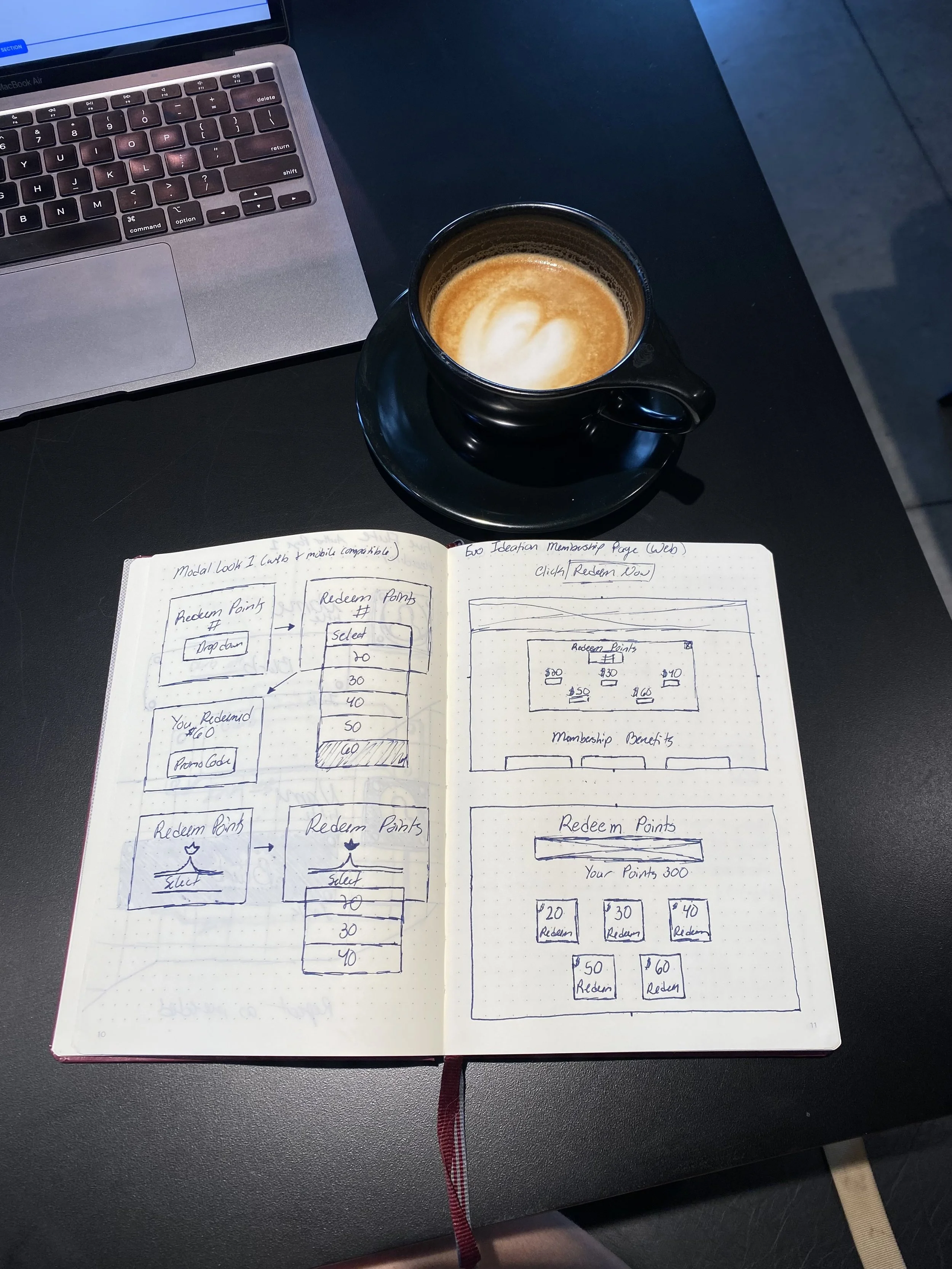
This is a personal project that I presented to the UX team at Evo. I currently work for their customer care team and hear about the pain points our customers are having with the website. In this project I focused on the membership redemption point page for mobile. With the goal of creating a more intuitive process that will help customers smoothly use the points they have earned.
Current Feature
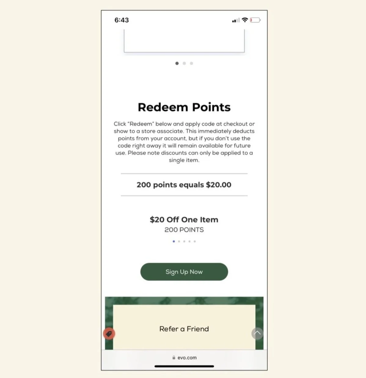
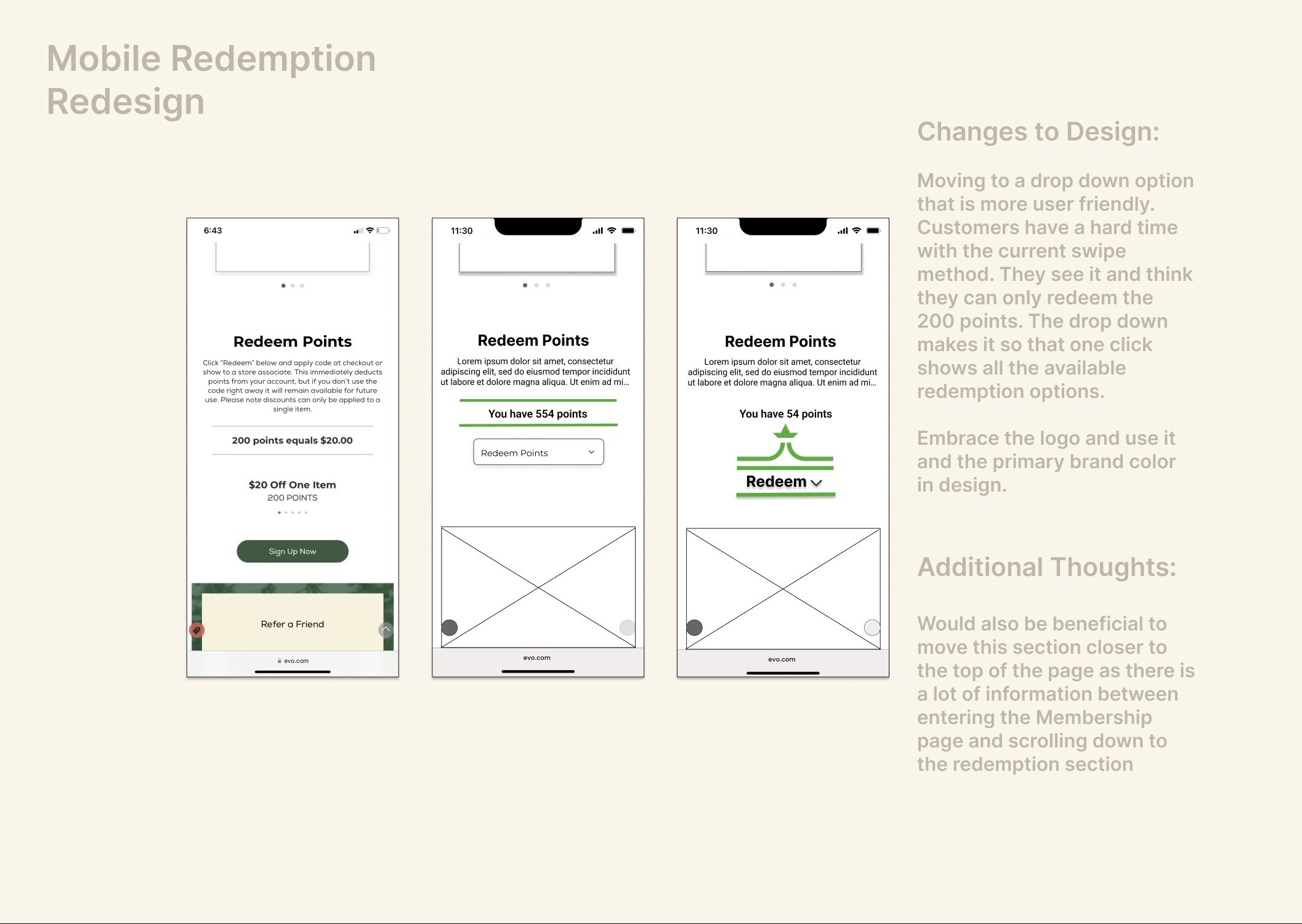
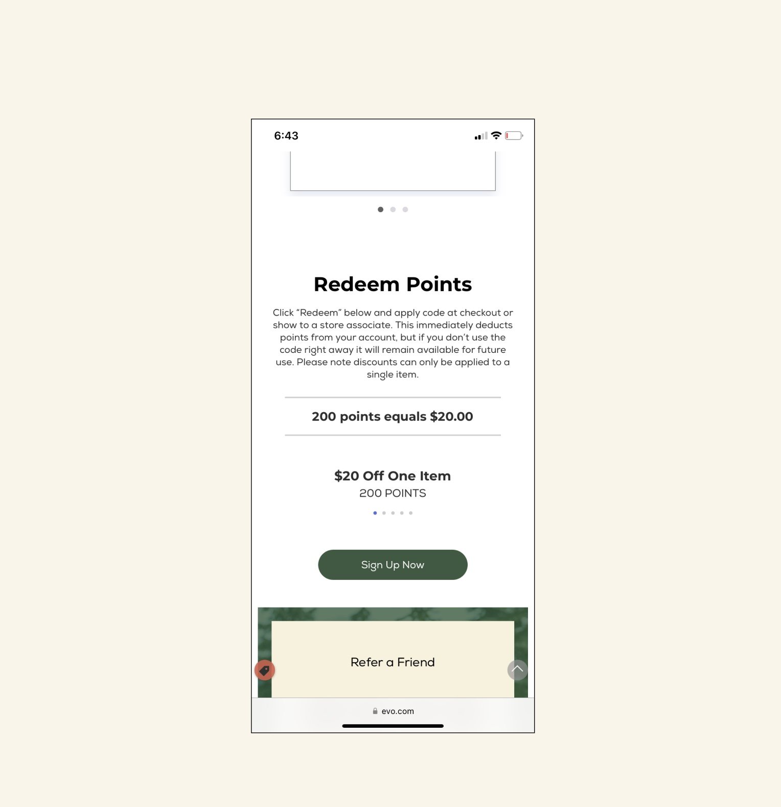
As you can see the original design has a swipe feature indicated by the dots below the “200 points” line. This was not intuitive for many customers who had issues trying to redeem more than the 200 points.
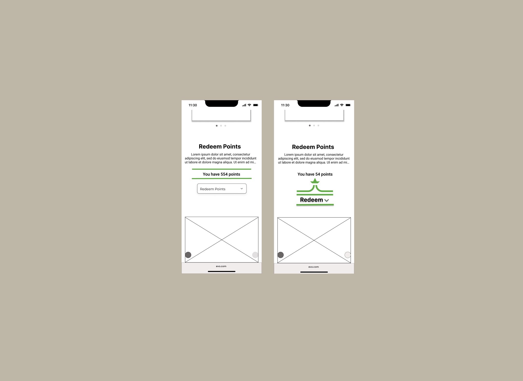
Redesigned Feature
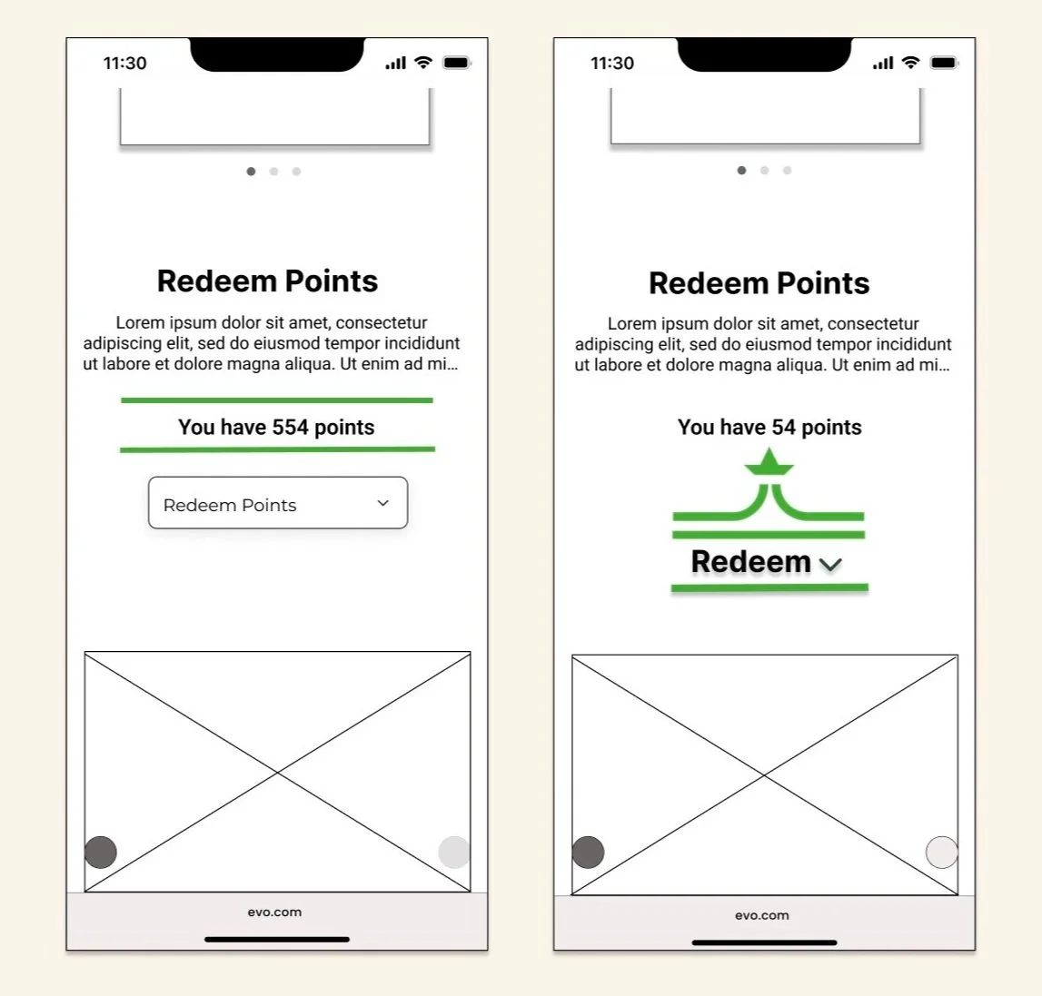
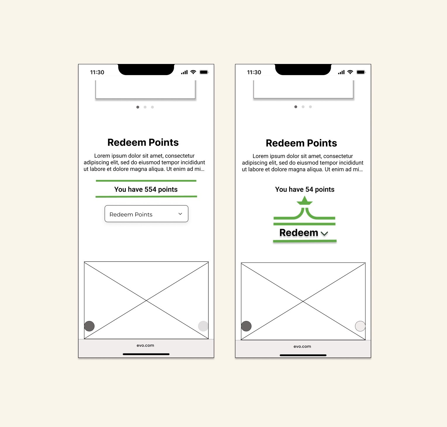
After identifying the problem a drop down was the decided solution. I created two drop down options with different UI that go with the branding of the site.